Mobile design for port-side and ship-side maritime users
Maritime mobile users aren't a homogeneous group. Designing for the port-side and ship-side use cases changes layout, weight and interaction in important ways.
The default assumption on most maritime marketing sites is that mobile is an afterthought, a viewport you scale to so the desktop content doesn’t break. That assumption has been wrong for a decade and is increasingly costing pipeline. A meaningful share of maritime traffic comes from mobile, and a non-trivial share of that comes from contexts the desktop designers never considered: a port captain on a launch boat, a master at anchor, a chief engineer in the engine room, a port worker at the gate, a recruiter on a vessel deck.
Designing for the actual mobile contexts in maritime is different from designing for a London commuter on the Northern line.
Two mobile contexts that matter most
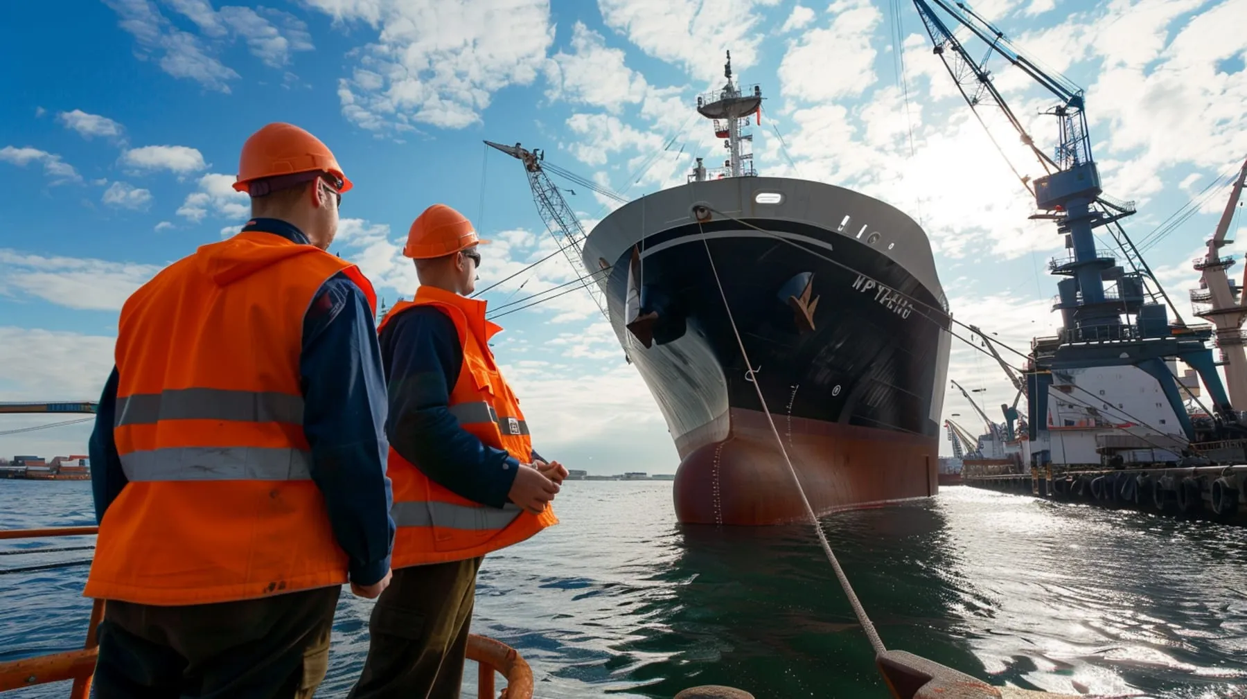
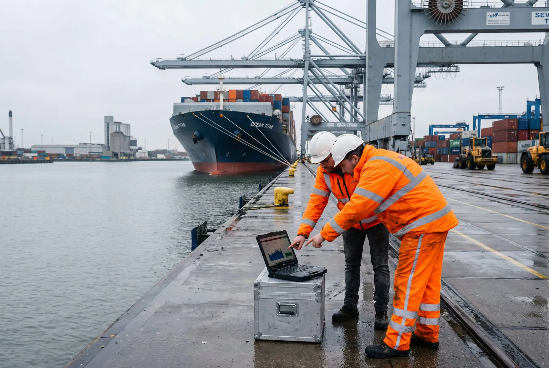
Port-side mobile
Port workers, port agents, terminal operators, surveyors, pilots, marine inspectors, customs and freight agents. Often outdoors, often gloved, often in bright sunlight or rain, often on a phone with a cracked screen and a flaky cellular connection. They’re checking spec sheets, parts availability, vessel arrival schedules, contact details for port operators, training course schedules.
What this context demands:
- High contrast text that’s readable in direct sunlight. Light grey on white loses every time.
- Large tap targets for users with gloves or wet hands. WCAG 2.2 minimum is 24x24px; aim for 44x44px.
- Click-to-call buttons on every contact reference, working on tap. Phone numbers should be
tel:links, not text. - Click-to-email and WhatsApp where appropriate, since some markets default to WhatsApp for B2B contact.
- Offline tolerance. Service workers that cache the most recent visit. A port worker walking into a coverage hole shouldn’t see a hard error.
- Fast loading on weak signal. Spotty 4G in port estates is normal. Build accordingly.
Ship-side mobile
Crew, officers, superintendents, masters, chief engineers, crewing managers using personal devices on board. The vessel may have decent wifi (if it has Starlink Maritime), reasonable wifi (modern VSAT) or borderline-unusable wifi (legacy VSAT, especially on legacy bulkers and OSVs). Crew often have data caps, time slots or rate-limited access.
What this context demands:
- Aggressive page weight discipline. Mobile homepage under 400KB transferred is achievable for a properly built site. Anything heavier punishes ship-side users disproportionately.
- No autoplay video. A 6MB hero video that triggers on a contended VSAT is a non-starter.
- No third-party scripts that block render. Chat widgets, consent banners, analytics tags loaded synchronously each add seconds to ship-side load. Defer everything non-critical.
- Forms that work over flaky connections. Server-side validation that returns useful errors even if the client-side JS hasn’t fully loaded. Don’t lose form data on a connection drop.
- Resilient downloads. A spec sheet or training brochure download should be reliable. Test resume behaviour, host static files on a CDN with high availability, avoid zip files that fail mid-download.
Layout decisions that matter on mobile
Vertical priority. Mobile is a vertical scroll. The information hierarchy that works in a desktop hero (left-aligned heading and text, right-aligned imagery) fails on mobile. Decide what comes first vertically and design from there.
Navigation. A hamburger menu that hides every option behind one tap is fine on a small site. On a maritime corporate site with eight services, three regions and two languages, a hamburger menu becomes an exploration puzzle. Mega-menu patterns adapted to mobile (full-screen, two-level, search-augmented) work better.
Tables. Maritime sites are full of them: fleet lists, technical specifications, tariff schedules, port arrival times. Default desktop tables collapse badly on mobile. Either re-flow each row as a card, or design a horizontal-scroll pattern with sticky first column. Don’t ship a table that requires zooming.
Forms. Field types matter. inputmode="email" for email fields, inputmode="tel" for phone, inputmode="numeric" for IMO numbers. The right keyboard saves your buyer time and reduces errors.
What desktop-first design gets wrong
A maritime homepage designed at 1440px wide with a multi-column hero, a 60/40 split and an animated background looks great on a designer’s laptop. On a 380px Android in dim light on a vessel deck:
- The animation eats CPU and battery.
- The 60/40 split stacks awkwardly.
- The hero CTA is below the fold and sometimes below two folds.
- The body text is illegible at default sizing.
- The mega-menu doesn’t work without a redesign that nobody scoped.
The fix is to build mobile-first as a discipline, not as a retro-fit. If the desktop version looks busier than the mobile version, you got it the wrong way round.
Test where your users actually are
Three tests on every maritime build:
-
Outdoor sunlight test. Take the phone outside, mid-day, full brightness. Read the homepage. If body text fades, contrast is wrong.
-
Throttled connection test. Chrome DevTools, “Slow 3G”, high latency. Reload. If the page is unusable, ship-side users will think so too.
-
Glove test. Use a stylus or your knuckle. Can you tap the navigation, fill the form, complete the flow? If buttons feel cramped, scale up.
Mobile maritime users aren’t an afterthought. They’re some of the highest-intent audiences on the site. The build should prove it.
Frequently asked questions
What share of maritime traffic actually comes from mobile?
Should we serve a separate mobile site for ship-side users?
Is autoplay video ever defensible on a maritime homepage?
More on Web Design
-
Web Design
How to brief a maritime web design agency and not waste six months
A vague brief produces a generic site. Here's how to brief a maritime web design agency so you get a build that's commercially useful and on time.
 By Paul Clapp
 -
Web Design
Designing maritime case study pages that actually convert
Most maritime case studies are capability decks dressed as case studies. Here's how to design pages that move buyers from interest to enquiry.
By Paul Clapp -
Web Design
Content modelling for marine equipment product catalogues
Marine equipment catalogues fail when treated as marketing pages. Modelling them as structured product data unlocks search, comparison and integration.
By Paul Clapp